Author: mollycbuccini

  • The Disappearance of QR Codes

    The Disappearance of QR Codes


    I feel a little ridiculous for believing that fake social media post that claimed we’d run out of QR Codes by 2025. QR codes are not running out, but, they’re not as trendy as they were. Part of me feels vindicated, as a self-identified QR Code hater.

    Two or three years ago, I swear I saw these on a commercial every time I turned on the TV. Are QR codes just a fast fashion trend we all got tired of? 

    I wouldn’t call myself a traditionalist. I like innovation. And yet, I hate QR Codes being used in mainstream graphic design. Maybe because I was ungently pushed towards including them in all my college assignments. We live in a phone-based society, and opening your camera app is easier than having to transcribe a website url. It makes sense. But I have an irrational response to them nonetheless.

    Is it simply because QR Codes are ugly? A lot of designers don’t try to integrate them, they just slap them onto the product—much like a barcode for a commercial product. The design of QR Codes is loud, garish, and can disrupt the flow of a design. I think that most graphic designers would call their work art. I certainly would. I think it’s reasonable to not want something ugly slapped on your art.

    The Anatomy of a QR Code

    But before we can hat is a QR Code? I was genuinely curious. Know thy enemy, and all that. Let’s dive into the anatomy of the QR Code.
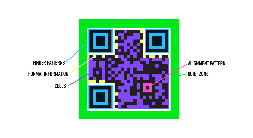
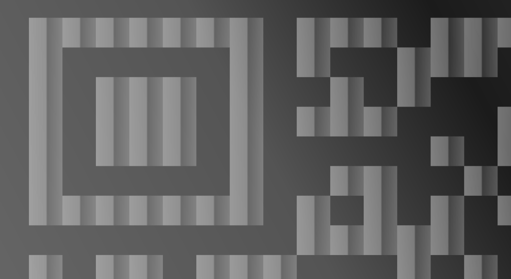
    Finder patterns : the three large eyes in the corners. They orient the QR Code so it can be read correctly.

    Alignment pattern : or, that little nub. It’s a marker that corrects skewing/stretching when a QR Code is being captured on a phone.

    Quiet zone : the blank space that keeps the QR Code separate from the background.

    Format information : a data strip that helps decode the image; has an error correction tool for a QR Code that’s partially damaged.

    Cells : the grid of black and white squares that makes up most of the QR Code. They function like binary code (1 / 0, black / white)
    I think the design of QR Codes is what makes them so ugly to me. They are, by their nature, asymmetrical, with awkward spacing. There’s only so much you can do to make them pretty. They are utilitarian, which is good! But should be accounted for.

    Qr Codes were first created in 1994 by Masahiro Hara and his team at Denso Wave (within Toyota Group) in Japan, to track automobile parts in factories. Currently, QR Codes are used in transportation, banking, customer service, and more.

    I think designers need to ask ourselves: what is enduring? What do people like? Whether it’s QR Codes or any other element. Call me a pastoralist, but I value what is pretty and what is timeless. I mentioned that QR Codes are on the way out, but there may be a resurgence, or another techy element that designers feel the need to take.

  • Are we in a Post-Print Design Landscape?

    Are we in a Post-Print Design Landscape?


    When I was working in my first graphic design job, I remember overhearing a conversation. We were a small non profit with a problem: with sudden funding cuts, we needed to be more cost-effective, and that meant we had to rethink our print operations. That got me thinking: what’s the environmental footprint of designing for print vs digital? Are we moving away from print as designers?

    Unsustainable Print

    Globally, paper (and ink) are major waste sources. Paper is (much of the time) recyclable, but that doesn’t account for the entire print lifecycle: logging, print mills, contaminated paper that has to go to the landfill, toxic products from ink… et cetera.

    In my previous job, printing was also a money drain. For every yearly event, the company had been printing new stationery, including various signs, brochures, table cards, and such… and it was all branded. We couldn’t reuse the signs branded with ‘2023 edition of X event’ in 2024 or 2025. So into the trash it went.

    When the company had to cut down on materials, I think it was a blessing in disguise. We were forced to be smarter, which also translated into a reduced environmental footprint.

    One of the most ingenious concepts from my former company was not only removing the branding on stationery, but creating generalized designs, say, for our long-term sponsors. We could reuse the same signs for different types of events.

    And the kicker is this: in 90% of instances, no one cares about single-use print. This is the distinction between valuable print (sponsor signs, print for event spaces, specialty magazines) and stuff that ends up in a landfill–your brochures, your flyers, your business cards, your place cards, your branded swag.

    But What About Digital?

    Molly, you might say (if you’re keeping tabs with the news/AI), digital media also has an environmental tax. That’s certainly true. But services like Adobe Cloud are demonstrably reducing the carbon footprint of design tasks; digitally shareable and signable documents are a huge part of this, not just in design but in all fields.

    AI Is its own beast that I will talk about later on in depth–and yes, it is an issue, but a separate one. Here I’m talking about print vs digital terms of logistics. You’re actually saving money by switching to digital. Win-win. AI (in design) is primarily about productivity/capital gains and, although it’s environmentally harmful, it’s got a lot of perks for employers.

    The future of print

    I don’t want it to sound like I’m an anti-print crusader. Physical media is important. Digital has some pitfalls: power/electricity outages, and in some cases being less accessible. There are times where digital media just doesn’t deliver in the way print can. In my house: print books over Kindle, for life.

    I think we’re already seeing the disappearance of a lot of single-use paper/physical materials. In my own recent experience, I’ve done a lot of designing for Instagram and slideshow… meanwhile, I pretty much have forgotten how to prep a document with die lines for print. I’m kidding! (Not really)

    I think print will become its own niche/specialty in design, rather than something every designer deals with on a regular basis. I may be off the mark, but who knows?

  • Designing for Lofty Heights

    Designing for Lofty Heights

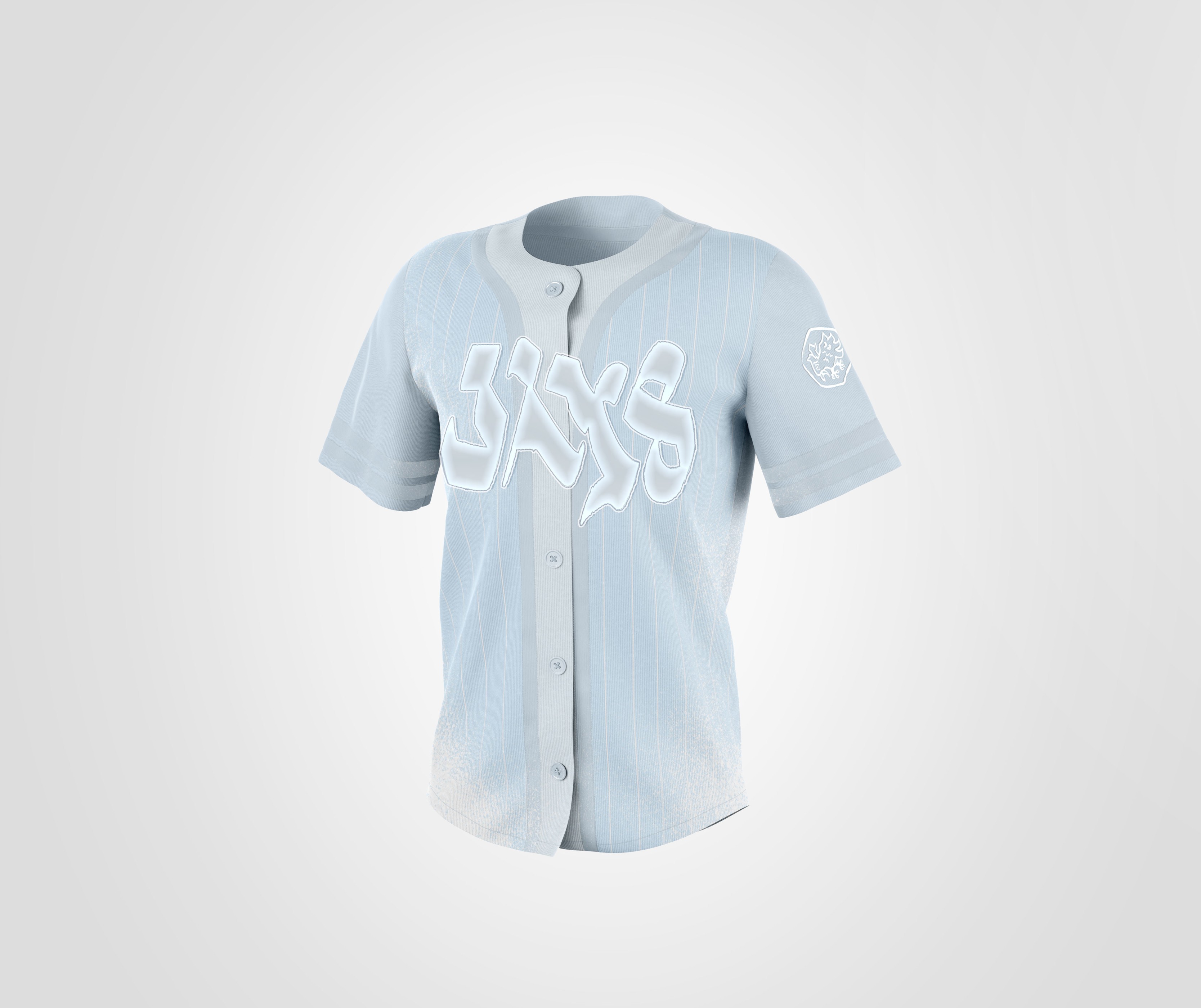
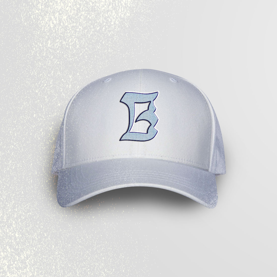
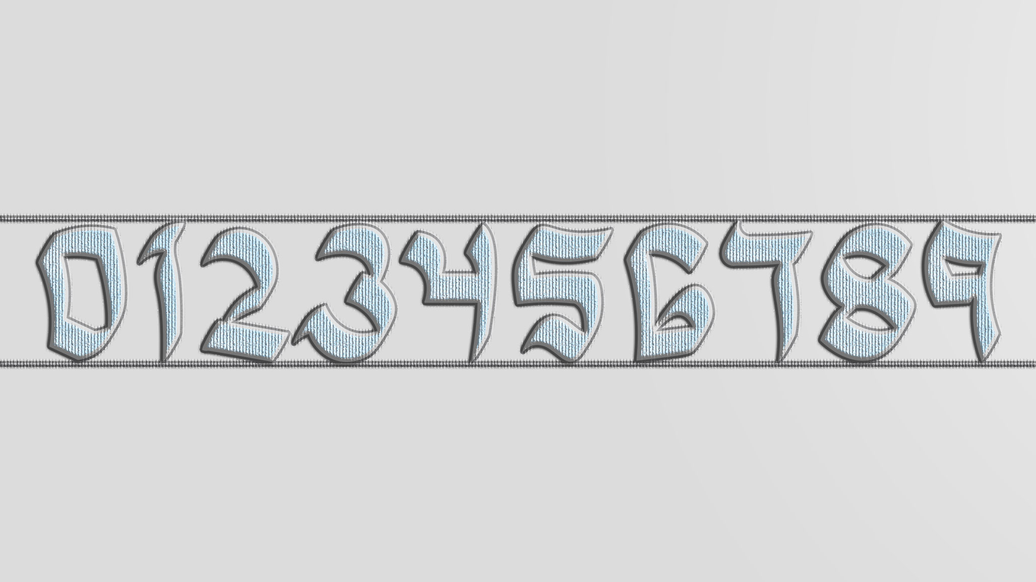
    MY GO AT TORONTO BLUE JAYS’ CITY CONNECT


    Graphic designers are visionaries, we want the best, no matter how unrealistic it may be. I will likely never be the graphic designer for the Toronto Blue Jays, but that doesn’t mean I can’t design my ideal City Connect uniform that’s better than the one we got…

    JERSEY

    Snow Warning… Because this is Canada/Toronto, people!

    CAP
    DECORATIVE ELEMENT
    NUMBERS
    LOGO GRAPHIC

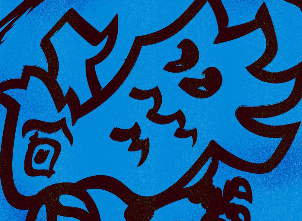
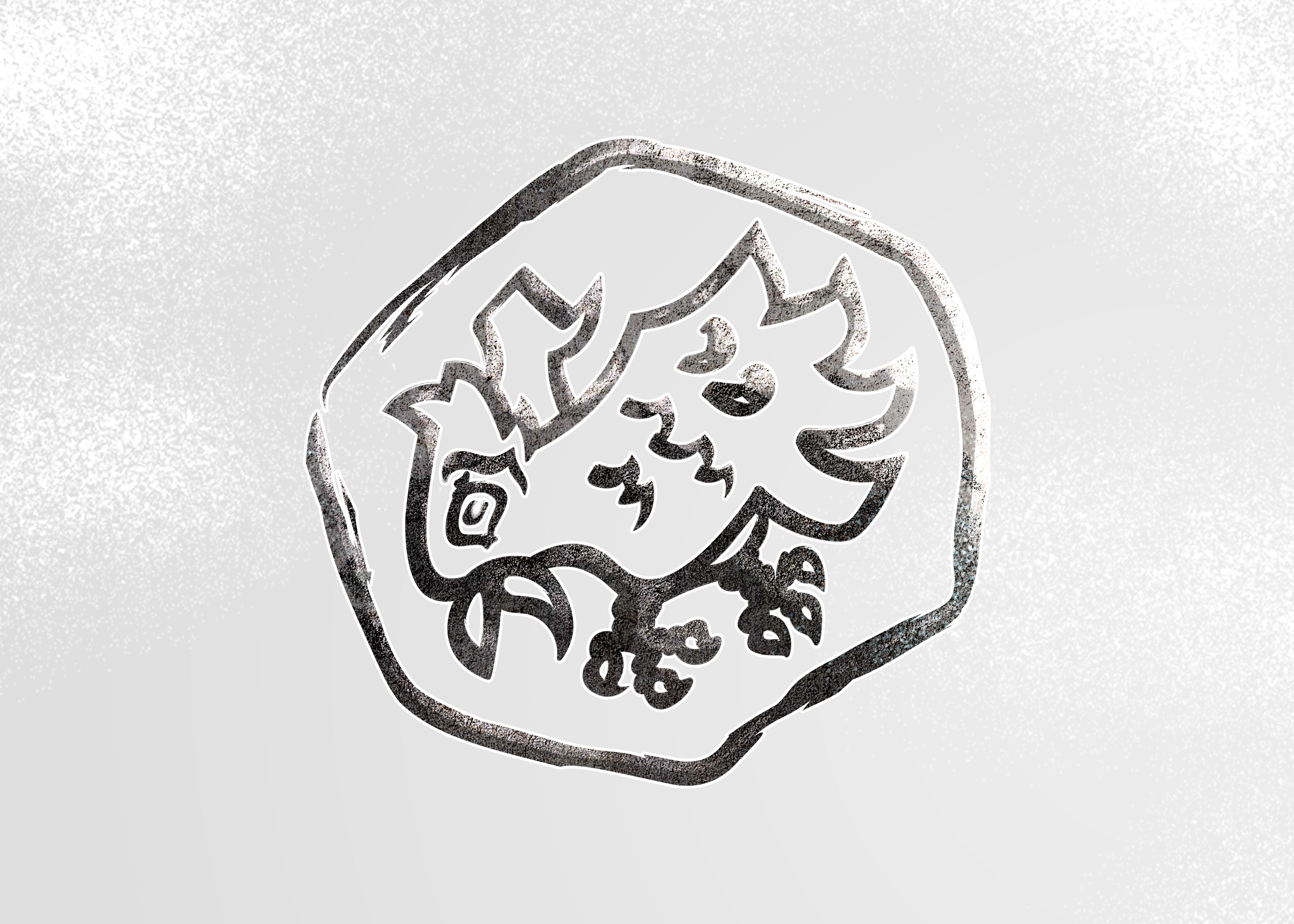
    I originally drew the logo with a calligraphy brush native to Adobe Illustrator. Then, I cleaned the lines up by hand. Look at how many anchor points I got rid of in the process!

    BEFORE
    AFTER (FINAL)
  • Revisiting My Past Work

    Revisiting My Past Work

    WHAT’S IN A LOGO?


    From 2021 to 2024, I was a student at Algonquin College’s Graphic Design program. This was my first foray into the field: before then, I was a traditional artist, with very little knowledge of Photoshop. But how much has changed since then? I’ve gotten to lead professional projects and have refined my style and aesthetic sense.

    CALYPSO REBRAND – 2022

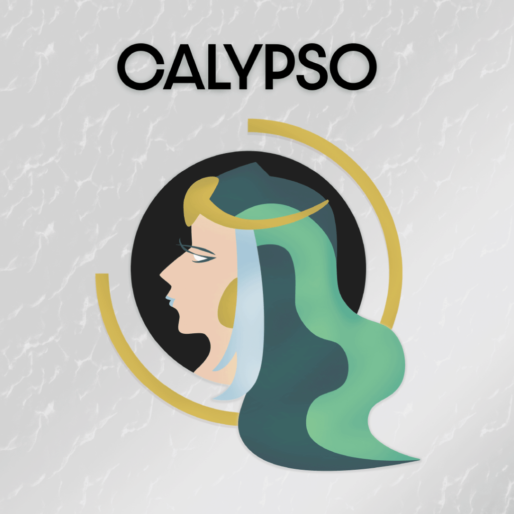
    For this assignment, I rebranded Calypso Waterpark in Limoges, Ontario. I personalized the Calypso figure, a water goddess, taking from Roman portraiture.

    CALYPSO – 2026

    I gave the water goddess a much-needed touch up! This redesign encompasses everything I have honed over the past four years: selecting colours, creating fluid lines and shape language, understanding target audience and concept. Everything is a little tightened up, and the new shape, a circle with a three-quartered band, creates a sense of dynamism.

    The Orange Monkey – 2022

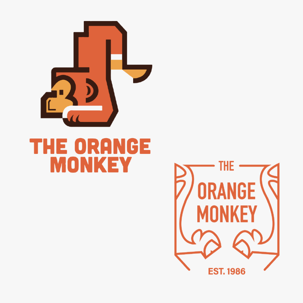
    This was my first major project, a logo rebrand that included two presented options and a branding guidelines booklet. I designed a monkey graphic (top) and a crest (bottom) the latter which I ended up selecting.

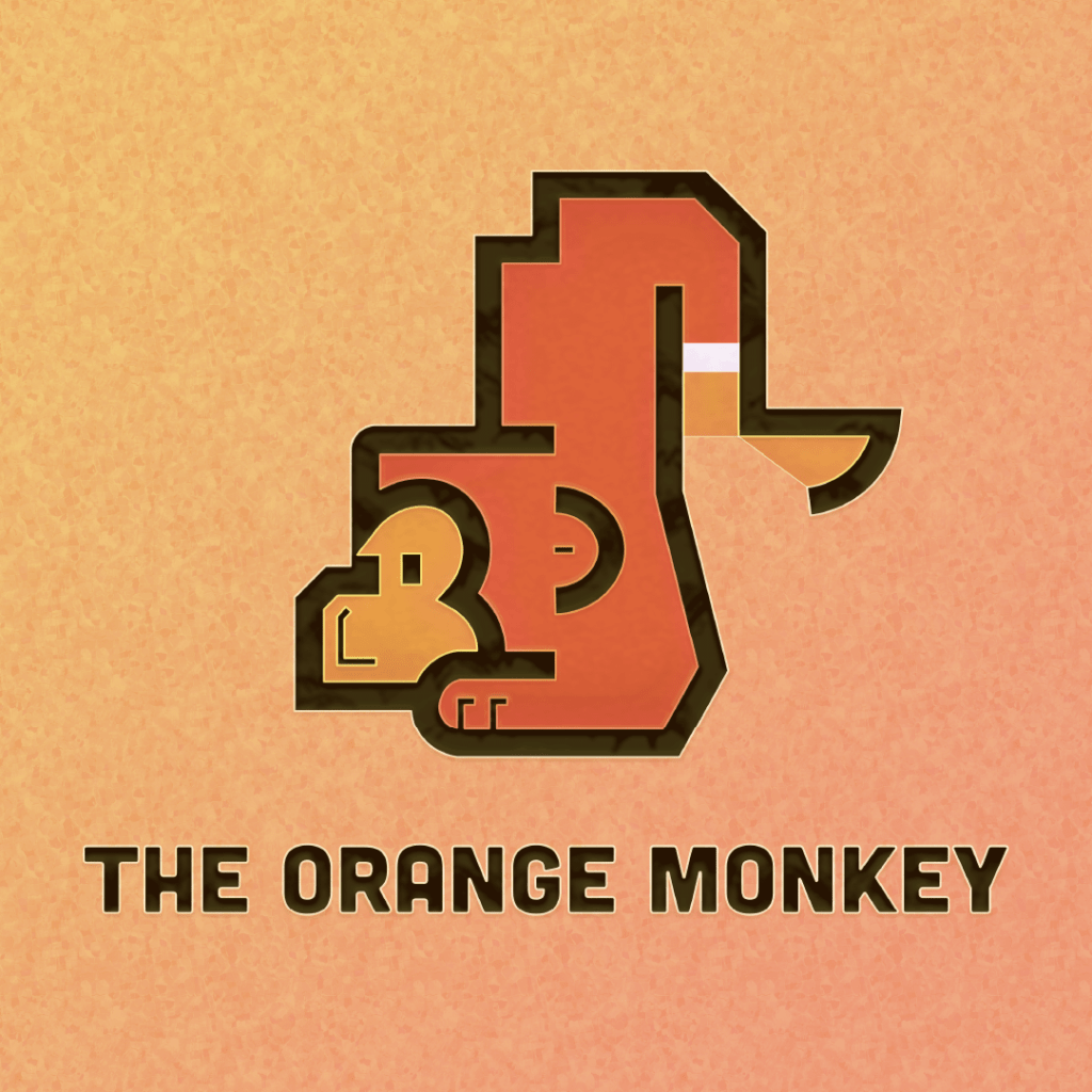
    The Orange Monkey – 2026

    It seems that when I go back to school projects, often I end up liking design B or C over the one I ended up pursuing – go figure! I can’t help but love this cute little monkey; it has elements of pixel design and chunky 1970s retrofuturism. More than any redesign, this one is all about the fine details: aligning key elements to create harmony.

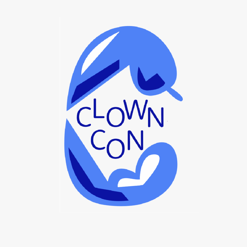
    ClownCon – 2022

    Here’s a concept where I got to be creative. I created event design for a made-up clown convention, featuring some of my favourite illustrative work. However, the logo was designed as an afterthought; it’s very possible that I made it in less than a minute.

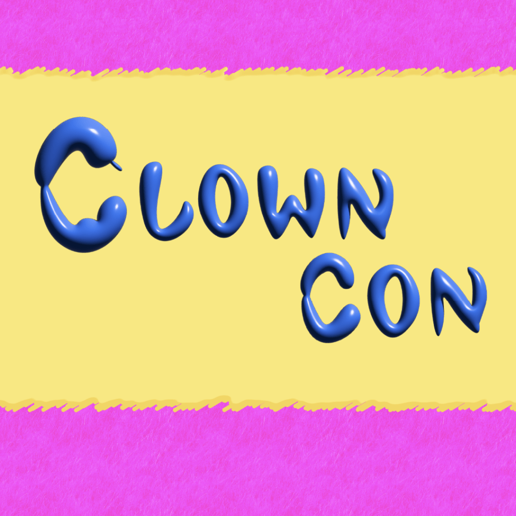
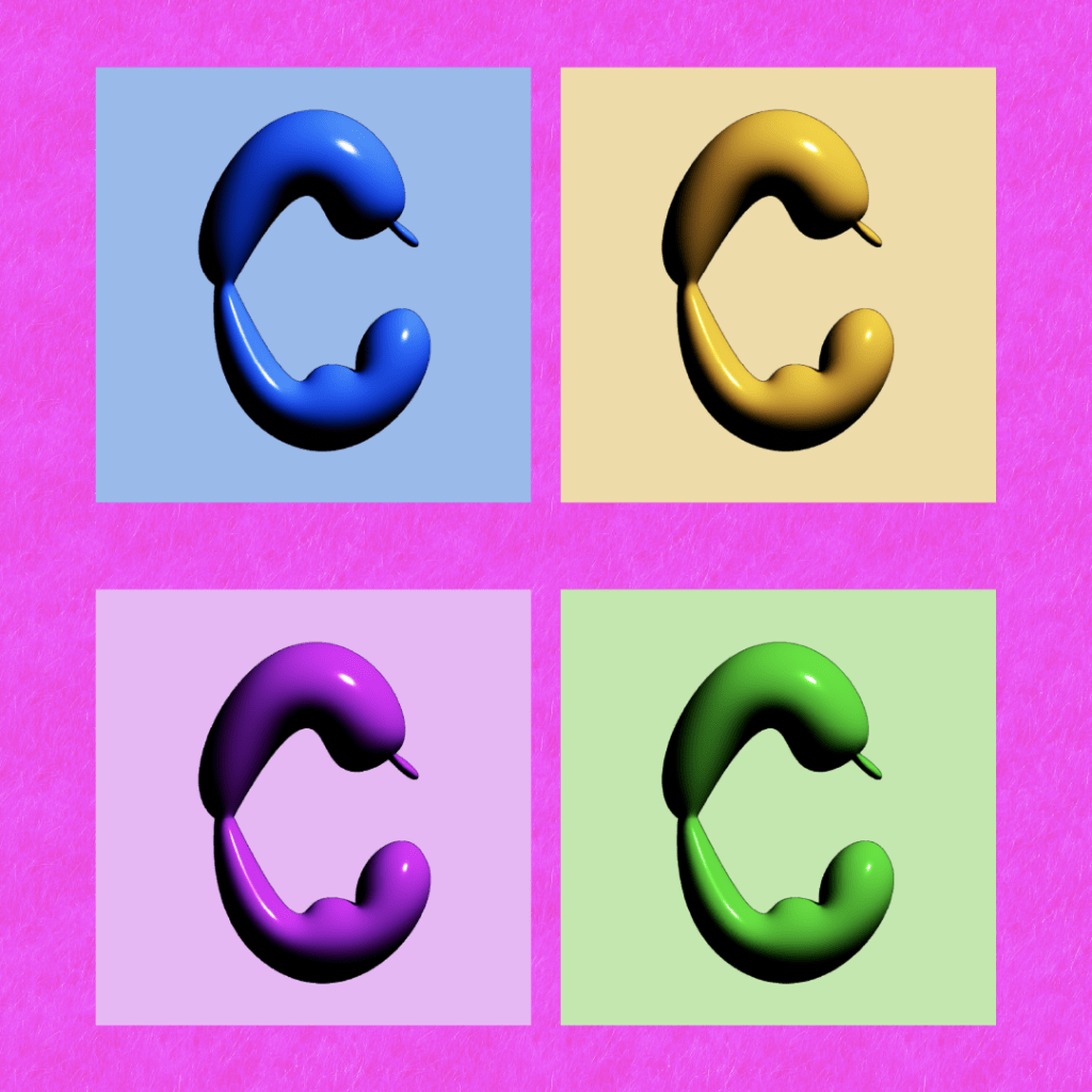
    ClownCon – 2026

    Recently I’ve been playing with Illustrator’s 3D raster effects. While there’s clear limitations, the inflate feature allows me to create text that looks like balloons. Ergo…

  • Building the Brand

    Building the Brand

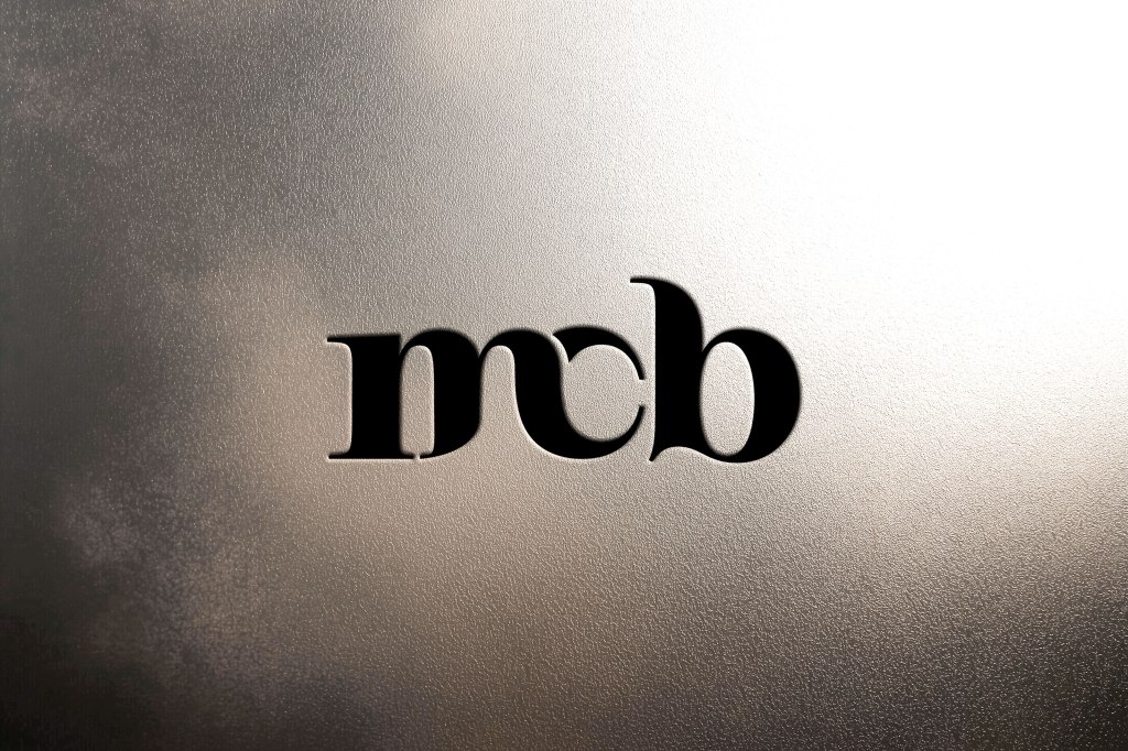
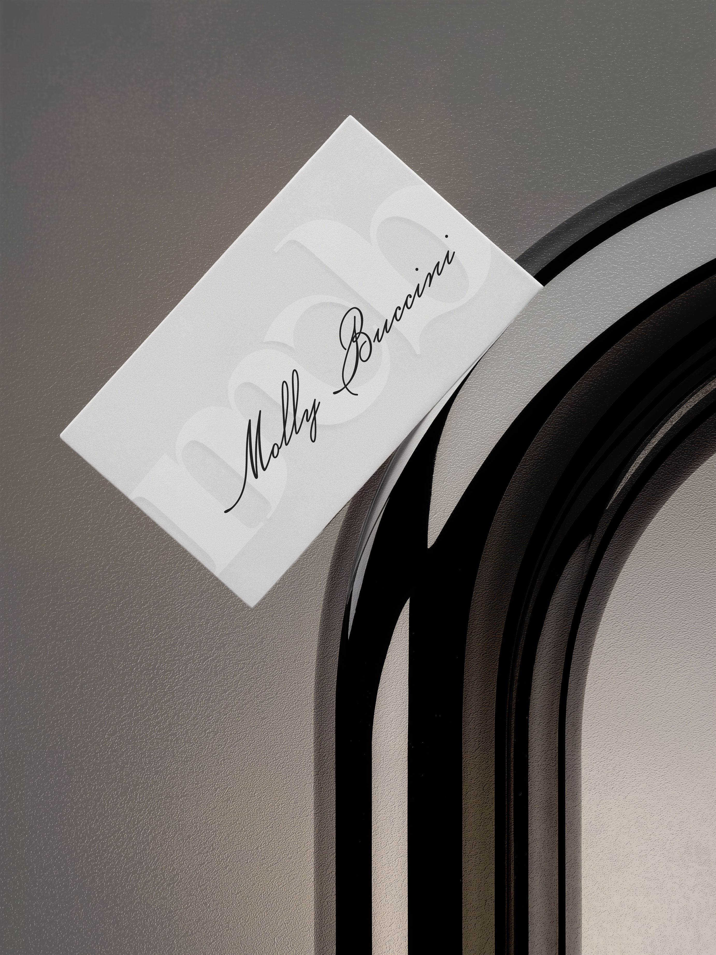
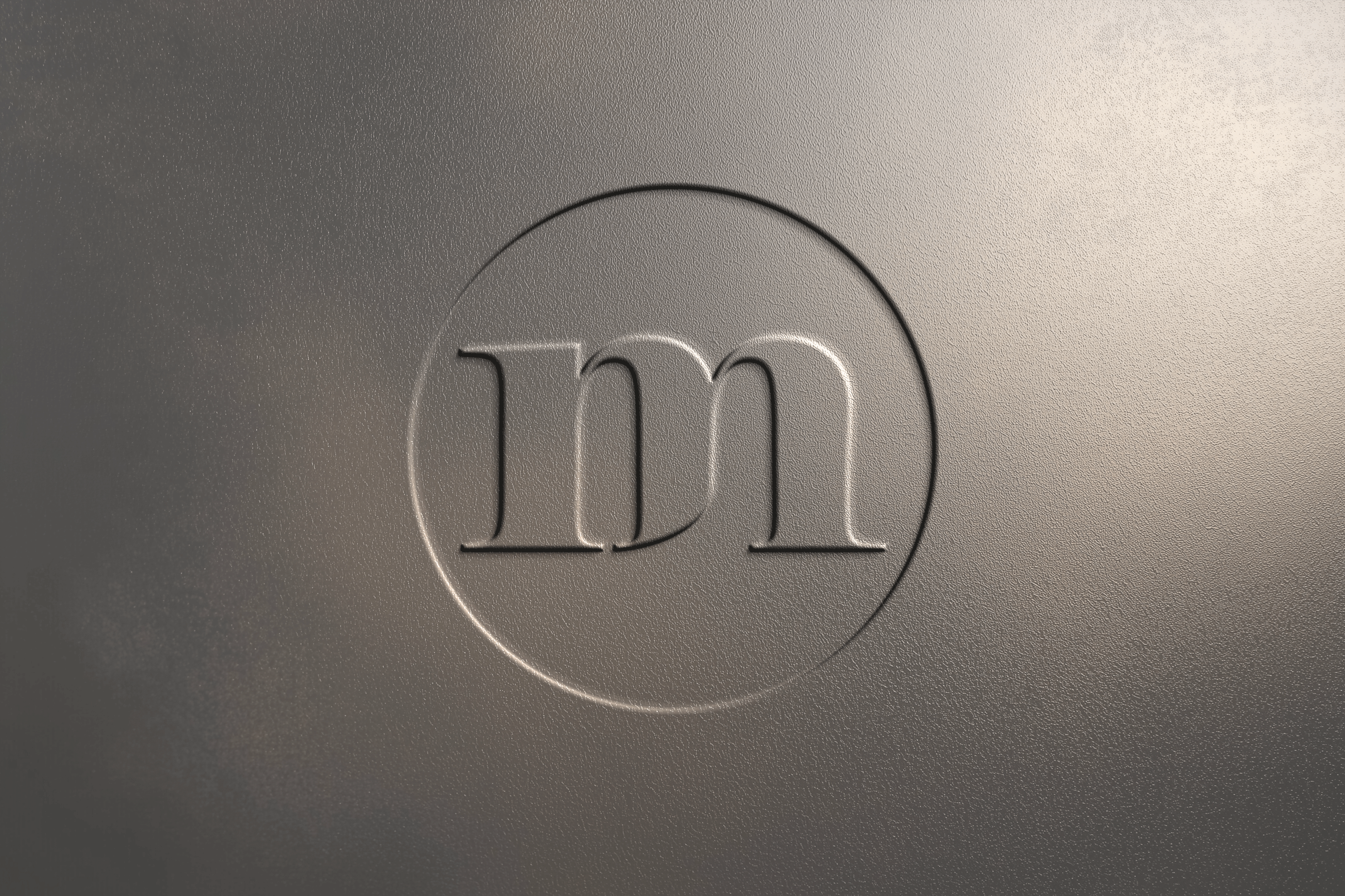
    My new brand is built on sophistication and enduring style. See it unveiled!

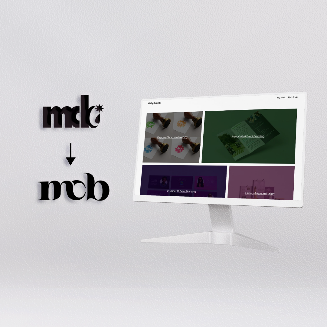
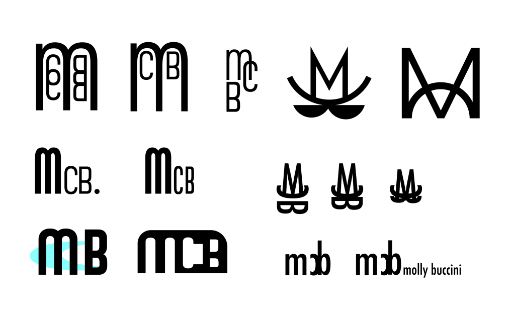
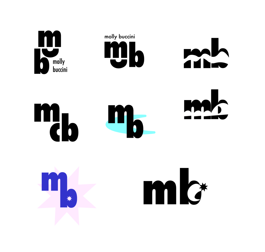
    I worked with different fonts, seeking a refined, yet memorable wordmark logo to represent my identity as a designer. Although I liked certain options from a design perspective, I didn’t feel like they’d be adaptable.

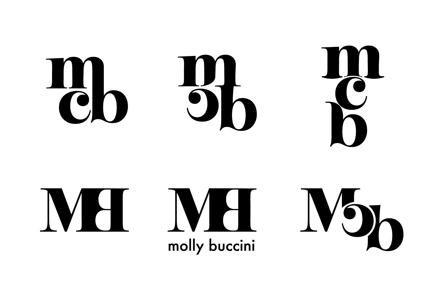
    I returned to this set of concepts incidentally, and knew I wanted to restructure the logo using this font. It was exactly what I’d been looking for.