I feel a little ridiculous for believing that fake social media post that claimed we’d run out of QR Codes by 2025. QR codes are not running out, but, they’re not as trendy as they were. Part of me feels vindicated, as a self-identified QR Code hater.
Two or three years ago, I swear I saw these on a commercial every time I turned on the TV. Are QR codes just a fast fashion trend we all got tired of?
I wouldn’t call myself a traditionalist. I like innovation. And yet, I hate QR Codes being used in mainstream graphic design. Maybe because I was ungently pushed towards including them in all my college assignments. We live in a phone-based society, and opening your camera app is easier than having to transcribe a website url. It makes sense. But I have an irrational response to them nonetheless.
Is it simply because QR Codes are ugly? A lot of designers don’t try to integrate them, they just slap them onto the product—much like a barcode for a commercial product. The design of QR Codes is loud, garish, and can disrupt the flow of a design. I think that most graphic designers would call their work art. I certainly would. I think it’s reasonable to not want something ugly slapped on your art.

The Anatomy of a QR Code
But before we can hat is a QR Code? I was genuinely curious. Know thy enemy, and all that. Let’s dive into the anatomy of the QR Code.
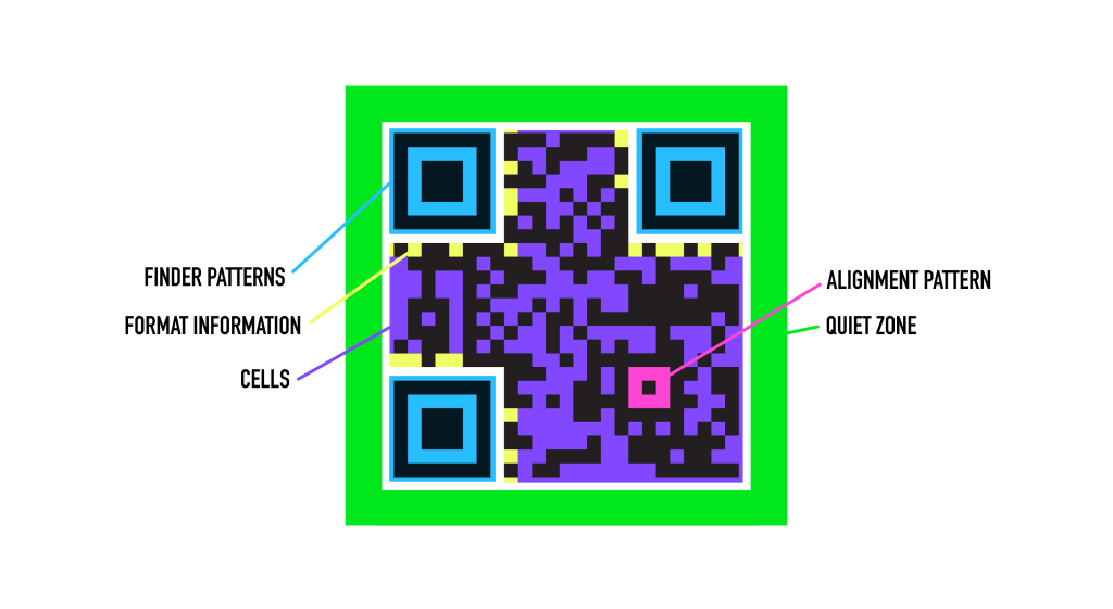
Finder patterns : the three large eyes in the corners. They orient the QR Code so it can be read correctly.
Alignment pattern : or, that little nub. It’s a marker that corrects skewing/stretching when a QR Code is being captured on a phone.
Quiet zone : the blank space that keeps the QR Code separate from the background.
Format information : a data strip that helps decode the image; has an error correction tool for a QR Code that’s partially damaged.
Cells : the grid of black and white squares that makes up most of the QR Code. They function like binary code (1 / 0, black / white)
I think the design of QR Codes is what makes them so ugly to me. They are, by their nature, asymmetrical, with awkward spacing. There’s only so much you can do to make them pretty. They are utilitarian, which is good! But should be accounted for.
Qr Codes were first created in 1994 by Masahiro Hara and his team at Denso Wave (within Toyota Group) in Japan, to track automobile parts in factories. Currently, QR Codes are used in transportation, banking, customer service, and more.
I think designers need to ask ourselves: what is enduring? What do people like? Whether it’s QR Codes or any other element. Call me a pastoralist, but I value what is pretty and what is timeless. I mentioned that QR Codes are on the way out, but there may be a resurgence, or another techy element that designers feel the need to take.
 Molly Buccini
Leave a comment